|
|---|
Wednesday, July 6, 2005
More from the Delete! project. ["But you know - anyhow, i feel free!"]
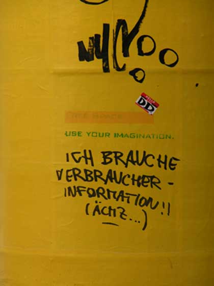
 ["I need consumer information! (Argh!)"]
 ["Blue would have been nicer"]
Apparently yellow was chosen also because it allowed the ads underneath to be seen. Interesting. Very interesting. Also (as my girlfriend, who is a color pro, confirms), yellow is an un-obvious color. It can be seen as very positive, dynamic, as it can be seen as melancholy. I can also see it as aggressive, or peaceful, depending on the circumstances. Thus - a color of ambiguity.
(via)
Technorati: art installation, installation, visual art, art, contemporary art, vvoi
Labels: design/architecture, land art/urban
0 Comments:
Subscribe to:
Post Comments (Atom)


